This is an AI image generation comparison for
text-to-image  prompt:
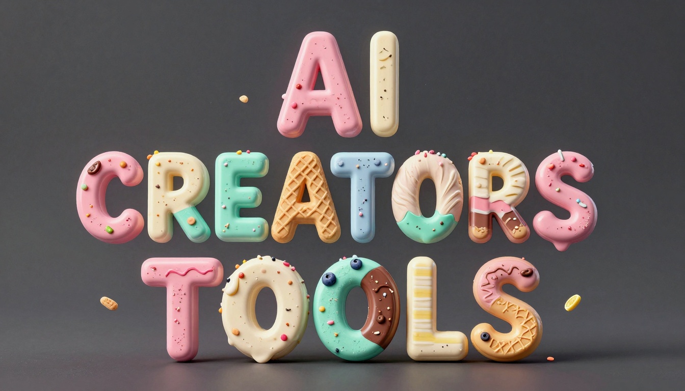
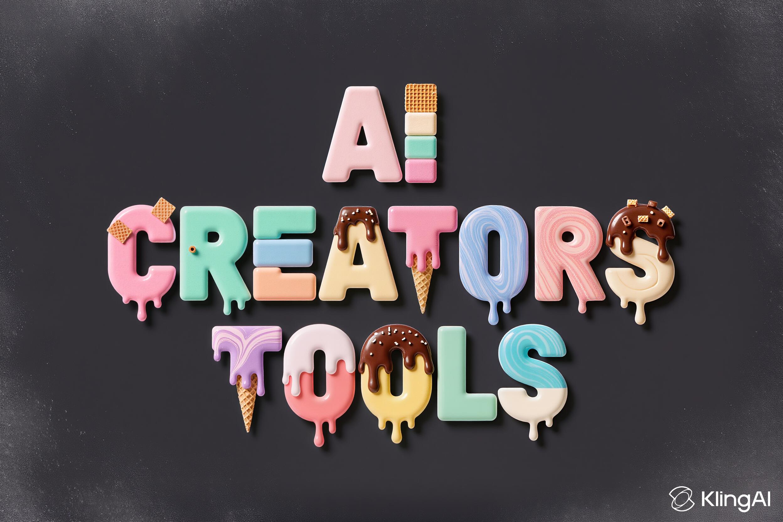
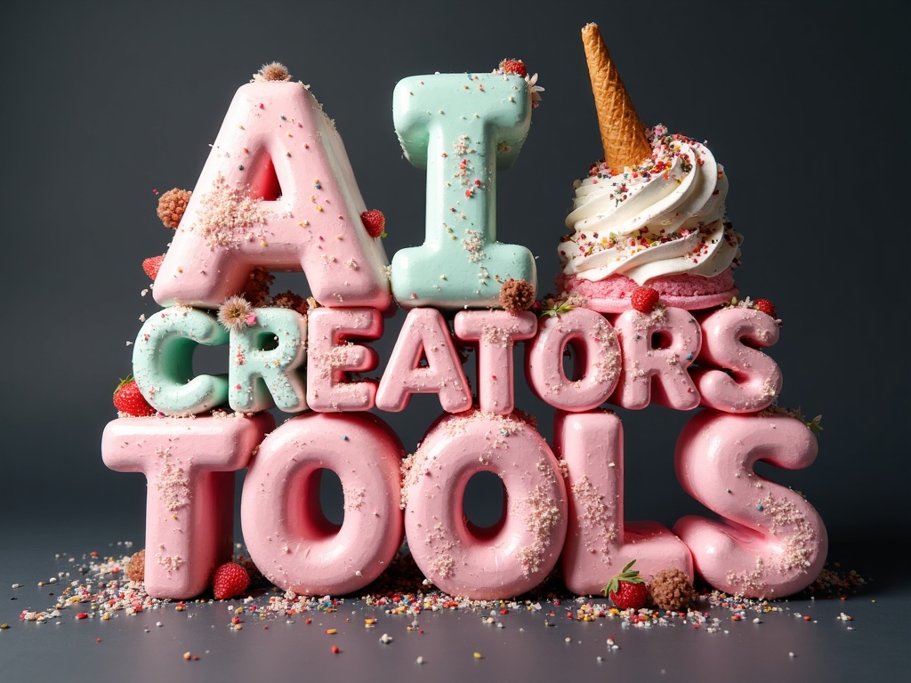
A three-line ice-cream typography reading “AI” on top, “CREATORS” in the middle, and “TOOLS” at the bottom, all letters made from vibrant ice-cream textures, arranged in a playful “dancing letters” layout where each character sits slightly up or down and alightly angld left or rightt for a fun, bouncy rhythm.Text: “AI CREATORS TOOLS” in UPPERCASE using a chunky geometric-sans skeleton with softly rounded corners, medium extrusion, and crisp cutouts to keep counters fully open.Font Material: asso...
Log in to see full prompt.
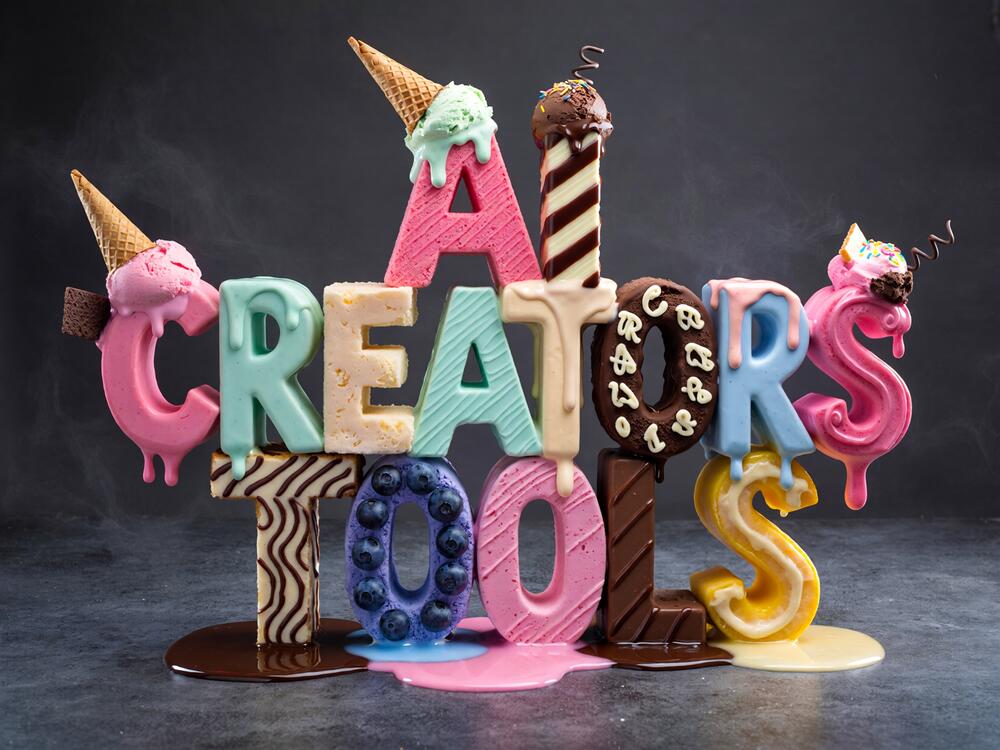
Tested: November 19, 2025
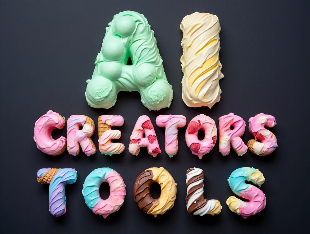
Yum textures and even the frosty mist is visible.
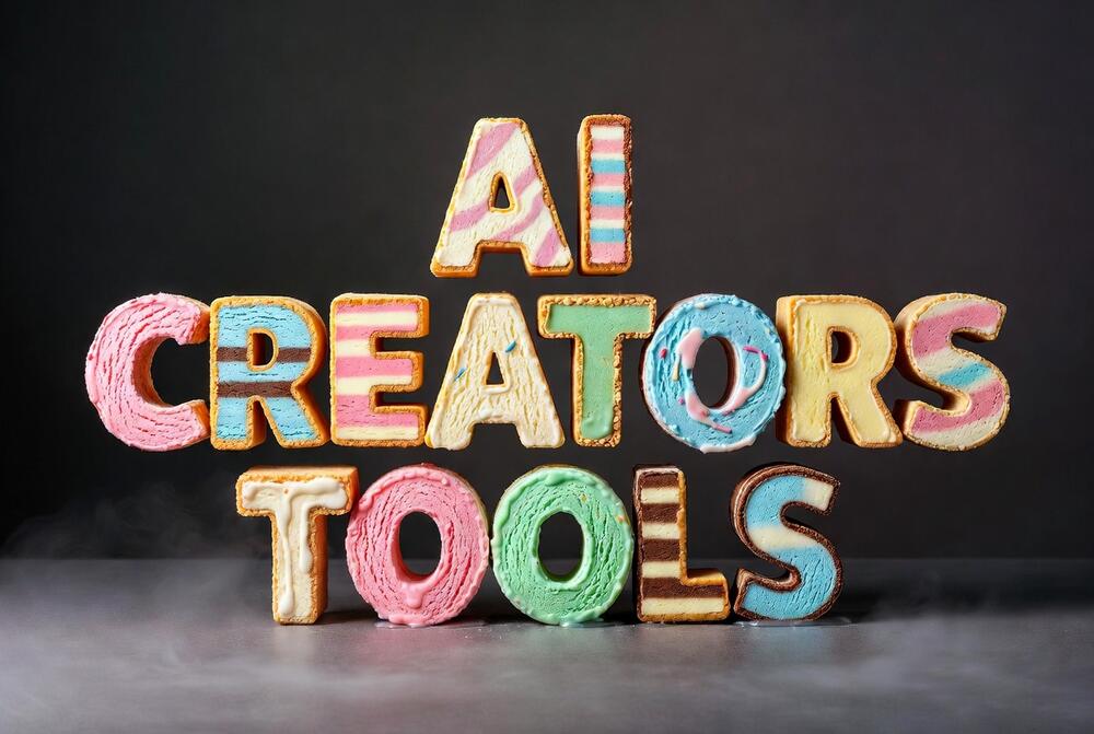

Tested: November 19, 2025
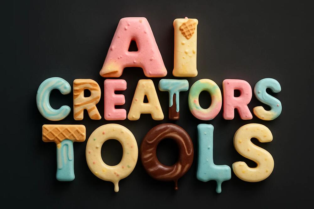
Nice touch with crumbs. Love the melting. Textures of ice cream letters could be more pronounced but still great overall.
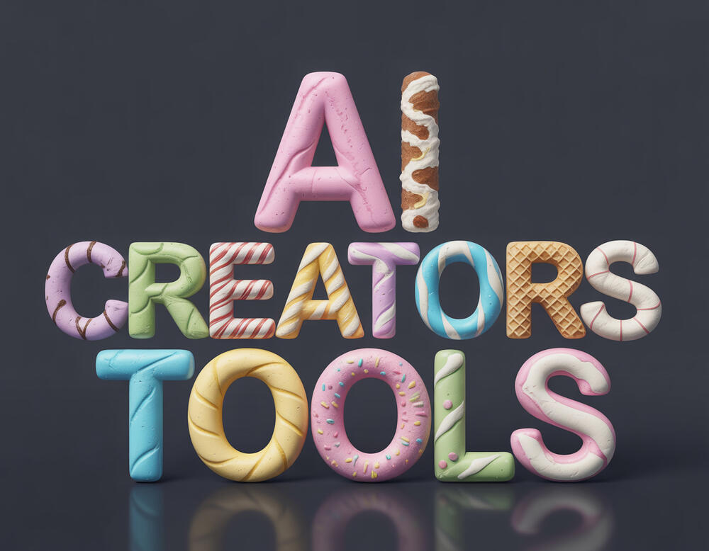
Tested: November 19, 2025
Very cute. You can tell it's something edible but not necessarily ice cream.
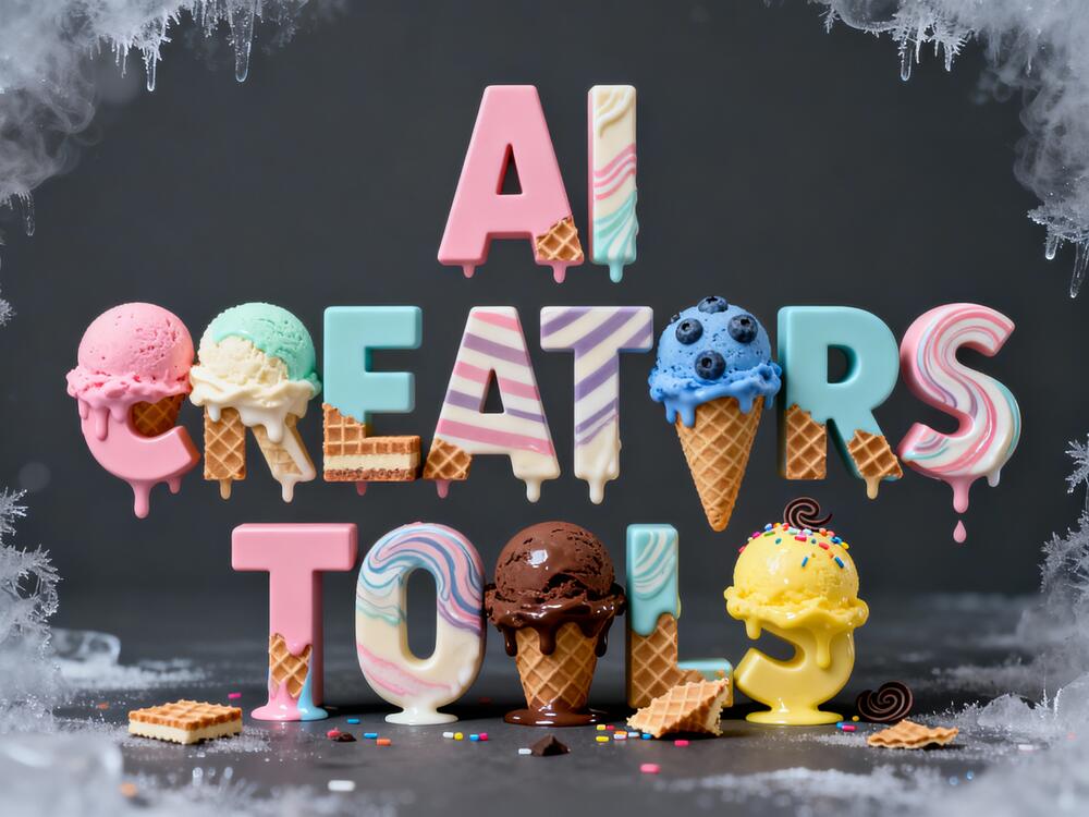
Tested: November 19, 2025
Impressive composition, creativity and textures.
Tested: November 19, 2025
Lovely voluminos letters, appetizing!
Tested: November 19, 2025
Tested: November 25, 2025
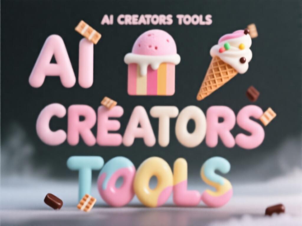
Love the letters textures, but added a duplicate text line underneath.
Tested: November 30, 2025
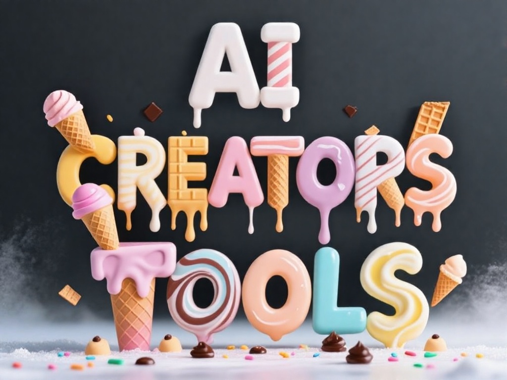
Text is written twice. And again, something's not right with the blur, you can check by the original link to FAL my prompt and the result.
Tested: November 30, 2025
Here with a tweaked prompt + 40 steps - better result. Odd, but you have to call for sharp focus to NOT get a blurry output.
Tested: December 3, 2025
Tested: December 5, 2025
Quite tasteful (or tasty) even though a bit flat. But text is correct.
Tested: December 9, 2025
Just adding a little creative typography prompt to SRPO model. Not bad.
Are the three text lines (“AI” / “CREATORS” / “TOOLS”) clearly stacked in the correct order?
Is each line composed of uppercase letters using a chunky geometric-sans structure with rounded corners?
Do the letters show varied vibrant ice-cream materials (scoops, swirls, cones, sprinkles)?
Is the “dancing letters” layout applied consistently, with slight vertical and rotational offsets per letter (this part of the prompt seems to be ignored)?
Is the background a solid matte charcoal with a soft frosty edge mist (only some models are able to show this)?
Are lighting and reflections soft and diffused, highlighting wet/melting textures without glare?
Do colors include pastel pink, mint, vanilla, blueberry, chocolate, and lemon tones?
Are grounding shadows visible and consistent beneath each letter?
Does the image maintain crisp realism and depth without visible noise or blurring?
Despite playful offsets, is kerning even enough to preserve legibility?
Check out the results from ImagineArt (ImagineArt 1.5) vs GROK (Grok Imagine v0.9 Image) vs Freepik (Flux Kontext [Pro]) vs Freepik (Ideogram 3.0) vs Freepik (Seedream 4.0) vs Reve (Reve Image 1.0) vs Sora (GPT‑4o) vs Freepik (FLUX.2 [pro]) vs Fal AI (Ovis-Image) vs Fal AI (Ovis-Image) vs Pruna AI (P-Image) vs Kling AI (Kling O1 Image) vs Fal AI (FLUX.1 SRPO) for similar or identical prompts side-by-side.


